Vintage Creativity: A Look Back at the Best 1960s Adverts
The 1960s, a decade of significant social and cultural shifts, saw the rise of alternative lifestyles, countercultural movements, and bold artistic expressions. This transformative era influenced advertising, blending vibrant youth culture with innovative design and messaging. Known as the ‘golden age of advertising,’ the ’60s introduced captivating print and TV ads that connected deeply with audiences through humor, emotion, and striking imagery. Here, we highlight ten of the most iconic ads from the 1960s, chosen by industry experts.
1. Volkswagen
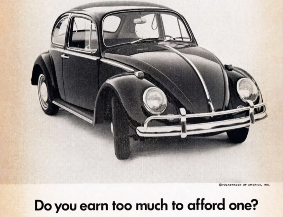
The 1960s saw Volkswagen’s print and TV ads, created by Doyle Dane Bernbach (DDB), revolutionize advertising with their minimalist design and clever messaging. These ads focused on simplicity, using minimal text and imagery to convey powerful concepts, resonating with everyday consumers by highlighting the brand’s reliability. The humor and irony in these ads, particularly the shift from promoting large cars to embracing VW’s smaller size as a benefit, made them stand out as groundbreaking in the industry.
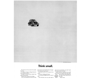
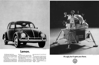
Images courtesy of VW/DDB.
2. Ford
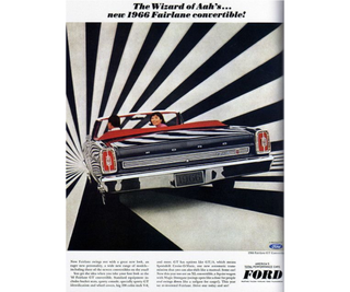
Another standout car ad from 1966 captured attention for different reasons. During an era dominated by power, speed, and stylish design, the Ford Fairlane GT Convertible ad campaign embodied the cool-factor that made cars so appealing. The vehicle itself was bold, fast, and stylish—completely opposite to the functional VW Bug. The ad’s look and feel mirrored this energy, featuring striking, attention-grabbing patterns in the background, perfectly reflecting the car’s dynamic and exciting nature.
03. US Public Service Announcement
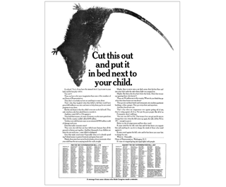
The 1967 PSA ad by DDB, known as “The Rat Ad,” is celebrated for merging social activism with bold design, reflecting the era’s Creative Revolution in advertising. It aimed to shame Congress into passing the Rat Extermination Bill, making such an impact that President Johnson acknowledged its influence. The ad’s striking presentation and the backstory of its creation highlight DDB’s innovative approach during this transformative time in American advertising.

4. Motorola
Motorola’s 1960s ads, illustrated by Charles Schridde, depicted futuristic homes that existed only in his vivid paintings. These “House of the Future” ads featured Motorola products set against stunning modernist architecture, blending technology with aspirational living. The ads appeared in major publications like Life Magazine and the Saturday Evening Post, showcasing a vision of a tech-savvy, stylish future. The combination of Schridde’s art and Motorola’s products made these ads iconic examples of retro-futuristic design in advertising.
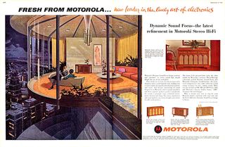

Image credit: Charles Schridde for Motorola, 1960s.
5. Bob Dylan poster
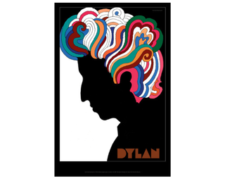
Lauren Hall, a designer with Brilliant Artists, highlights her favorite 1960s ad, Milton Glaser’s iconic Bob Dylan poster. Created for Dylan’s Greatest Hits album in 1966, the poster features a striking silhouette of Dylan with vibrant, psychedelic hair. Inspired by Marcel Duchamp, Glaser’s design is celebrated for its bold contrast of dark and vivid colors, embodying a rebellion against the minimalist trends of the time. The poster remains a standout piece in graphic design history.
6. Galt Toys
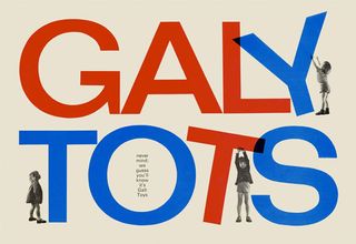
Lauren also highlights the work of Ken Garland, particularly his influential role in the 1960s design scene. Garland’s “First Things First” manifesto, published in 1964, challenged designers to prioritize socially responsible work over consumer-driven projects. British toy company Galt Toys embraced Garland’s ethos, commissioning him to create campaigns that focused on imaginative play rather than mere product promotion. Lauren admires how Garland’s work for Galt Toys balanced playfulness and functionality, using vibrant colors and whimsical illustrations to convey the benefits of the toys.
7. Schweppes
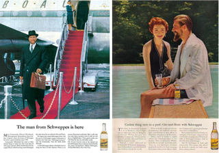
Allen points out that the use of distinctive and recognizable characters was a major advertising innovation in the 1960s, a tactic that remains effective today. He highlights Schweppes’ use of Commander Whitehead, the company’s suave president, in their ads, crafted by Ogilvy. This approach leveraged the persona to embody the brand’s desired image. Ogilvy pioneered this strategy, using personalities like the sophisticated, eye-patch-wearing man for Hathaway, to make brands unforgettable and distinctive, shifting the focus from product to persona.

08. Avis
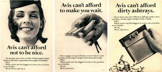
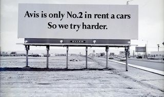
Orlaith Wood, a fan of copy-led ads, highlights the 1963 Avis “We Try Harder” campaign as a prime example of the 1960s golden era for such advertising. The campaign, penned by DDB copywriter Paula Green, positioned Avis as the underdog to rival Hertz, turning their second-place status into a strength by emphasizing their commitment to customer satisfaction. The simplicity of the sepia imagery allowed the bold, honest slogan to shine, teaching us that vulnerability and a bit of competitive edge can create memorable, effective ads.
09. Alka Seltzer
Rob Fletcher, founder of creative agency Isobel, praises the timeless creativity of 1960s advertising, specifically the 1969 Alka Seltzer commercials. The “Spicy Meatball” ad, with its memorable slogan repeated throughout, showcases sharp, fast, and still-relevant storytelling. Fletcher argues that this ad, along with “The Unfinished Lunch,” would still stand out today due to their unique approach and product-focused narrative. He highlights how these ads broke the rules and remain unmatched in creativity even decades later.
